My process.

I first draw on my sketchbook, there is nothing like some blank sheets of paper and some pencils. If a sketch has appeal, interest, attitude or personality then I take color it. The drawing is sketcy and very loose, I tend to leave it incomplete so I'll have room to modefy it later in the coloring process, I scan the image @ 300 dpi so i can color it in photoshop
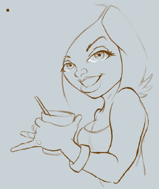
To select the Pencil lines only I made this tutorial, CLICK HERE . If I can't clean it up by using the image adjustments in photoshop, I sketch it again this time using my wacom 9x12 wacom board, I never leave the background white, so I change it to a light gray so when I add my white highlights the drawing pops up, I still sketch it quicky so I won'tloose the line quality, I also keep inmind keeping the thin and thick lines because they add weight and interest to the final drawing.
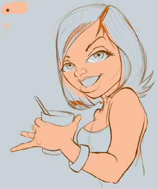
I make every color have it's own layer in photoshop, it's easier to modefy it later. I quickly apply a base skin tone color, I do this using a large brush, with out being so carefull if I go over the lines. At this time I start playing with colors setting up an appealing color palette, because there is nothing worst that colors that don't go well with eachother. I'm still practicing this, and who ever has master the color wheel message me, I want to be your friend!
I add some white, again every color has it's own layer.

Viva de orange hair!!!

On this step I add value to the skin tone, decide where the light is coming from.
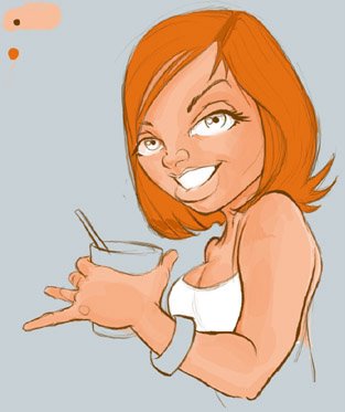
I repete this step again this time using a bigger brush and decreasing the opacity of the skin tone giving the drawing volume.

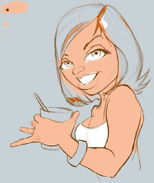
I add another shade of orange to the hair, giving it volume to the hair and the illusion that the hair is actually going around the head.

Adding more details like teeth, I also add focus to the eyes, going over with a darker color, even tho it's a cartoon illustration, I keep in mind the round shape of the eyes, because I want the eyes to be the main focus of the illustration.
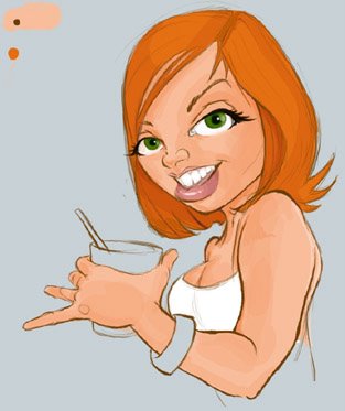
Add more detail, like color in the lips, leaving some highlights to give the lips volume, also aways been a sucker for green eyes girls.
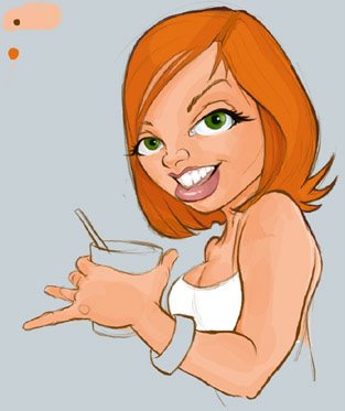
I add some dark touches to the lines, usually where two lines intersect, or inbetween lines, like inside the mouth area, it makes the illustration popout a little, however Don't over do it!

Adding up light blush to the cheeks and eye shadow.
Color in the props. and add some highlights, personal touches do count! Is that my logo as her tatoo? ;)
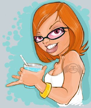
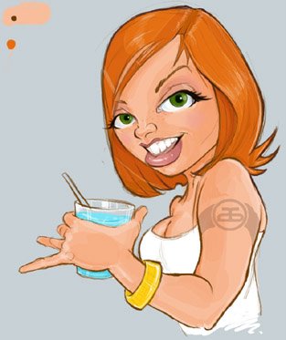
Drew in her a pair of pink club glasses, because she looked like she was at a club! and I added a blue background, sure why not!
 This is what the process looks like, and having dual monitors helps increase productivity, but it's not necessary.
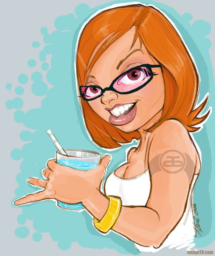
click it to view final stage, as you can see, I layer color ontop of color, I make no attempt to blend the colors together. Of course It's not the only way or the right way to color, it's just the way I do it, might be similar or different than other artist. Now GO EAT COOKIES!
FIN
posted by heri at 3:01 AM
![]()


14 Comments:
Thanks so much! I love seeing other artists progress how-to pieces. It's always handy to see how someone else works.
She's cute! Nice to see your process too.
very nice work!!
process...you gotta love it.
yo, i'm glad you liked my "attack."
you keep attacking too and we'll all just set the world on fire...in a good non-violent just using pen, pencil, and photoshop kinda way of course. :)
Killer work! Thanks for sharing.
I've always wanted to figure out how to do the dual monitors thing, but I'm just so lazy.
Zombi, thanks for stoping by. I saw someone do the a work progres, so I did this one. :)
Brian. Thanks.
Alina... YAY!
Ree. your attack is killer!
Spacesick.
thanks, and dual monitor is the best! one you have two, you can never go back to having one! it helps a lot, and it's easy to do.
I am totslly honored u did a sketchbook on me and my work, glad I inspire you and people like you inspire me too....thank you
great blog!
simply awesomee .. u should try the Illustrator Live Paint option to color .. it's pretty cool.
Thanks for taking the time to make a tutorial post on coloring. I can't say I have mastered the color whell but i do get back on when the bastard throws me off. ;)
Very insightful, thanks for posting your process!
-A
Fantastic work,great to see the work behind this pic !
Heri, tu eres el mejor!
Hey there, neat work. As a tip I actually use the polygon lasso to fill in the major colour areas. just make sure it's hidden underneath the linework.
Also, if you want some colour harmonies get the book from Amazon Color Index . It gives you good ideas for a base colour pallete.
Theres actually three books that you can get together in one set for a good price, but this one is far the best of them.
Cheers,
Nash from Daily Charcoal.
Daily Charcoal
ps: So should I add you to my friends list on Facebook now?
This comment has been removed by the author.
Post a Comment
<< Home