
Court Jester
Decided to draw a Court Jester, never drew one before, there is always a first time.
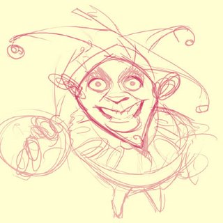
This time was drawn directly in photoshop, quick 1 minute sketch.

shaping it up a bit, adding the thin and tick lines
I have a problem with lighting, I understand the lighting set's the tone and mood, I'm not sure how to fix this, my lighting seems to be everywhere, can anyone help me with this? Possibly Chris? I want to learn and improve, also what else should I work on?
I appreciate your help, comments, or suggestions
-heri
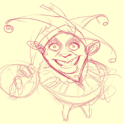
posted by heri at 8:01 PM
![]()


3 Comments:
I hate you and am inspired by you! Damn you Heri for being so good hehe now I want to stay up later and draw more, ah well I guess I'll get all the sleep when I'm dead.
Kevin
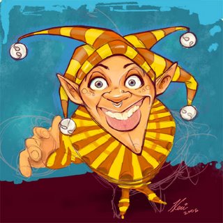
I trap I still fall into sometimes is not knowing when to stop highlighting. Putting highlights where there can't possibly be any, given the light source.
Your lighting is a little inconsistent. If you look at the eye highlights, there's a light coming from the left. Bu the nose highlights, and some of the hat highlights suggest otherwise.
But I think your main problem is lack of shadows. This is what's making your pic look so bright. If we go with the left light source, his head would be casting a shadow onto his frill, the right side of his hat (his left) would be darker in places, there'd be a shadow under his nose and his feet and the underside of his palm would have shadows as well.
Another great tip which I recently learnt is- don't use pure white for highlights. Maybe use a pale yellow, and keep the white for the most extreme highlights (tip of the nose etc.) Also if you use a yellow light source the cast shadows are going to have a purple tinge to them (yellow and purple being complemenatry opposites.)
Here's some further reading from artist extraordinaire, Prometheus-
http://itchstudios.com/psg/art_tut.htm
k mcleod, Thanks Sr. I'm sleepless, some nights i don't stop drawing.
Thanks for the tips Chris!
you're one of my many teachers, you just don't know it.
thanks for the link, I've seen it before, but i read it carefully this time, all of it! I took notes on it, on the hues section he mentions " The best way to learn the hues of the human body is to make studies of course. Don't forget that animals, monsters and objects also have hues. If you paint everything with the same hue and saturation it will look boring.
Some hues are due to ambient and reflected light."
I think this and not choosing and sticking with one main lightsource, makes my character feel boring. I will keep this in mind.
Post a Comment
<< Home